
GoodMaps
Project: Logo Exploration

GoodMaps approached me to explore a new logo direction that would establish a strong, memorable brand presence while aligning with their core mission of making indoor spaces more accessible. The challenge was to create a visual identity that encapsulated their values—innovation, inclusivity, and dependability—while leveraging mapping and location-based symbolism.
My focus was on developing multiple logo concepts centered around the letter "G," integrating recognizable mapping and navigation symbols to reinforce GoodMaps’ industry positioning. The goal was to create a distinctive mark that was both modern and scalable across various applications.

The exploration revolved around a strong "G" lettermark, ensuring instant brand recognition while maintaining simplicity and adaptability. Each concept was designed with versatility in mind, allowing for seamless application across digital, print, and environmental branding.


To visually connect the brand to its function, I incorporated elements commonly associated with maps and navigation, such as:
Location Pins: Representing wayfinding and precision.
Pathways & Routes: Symbolizing movement, accessibility, and connectivity.
Compass & Directional Cues: Emphasizing guidance and exploration.


Icons and illustrations were designed using the same geometric foundation, ensuring a seamless integration with the overall brand identity. The use of clean lines and structured forms helped create a recognizable and distinct visual language.
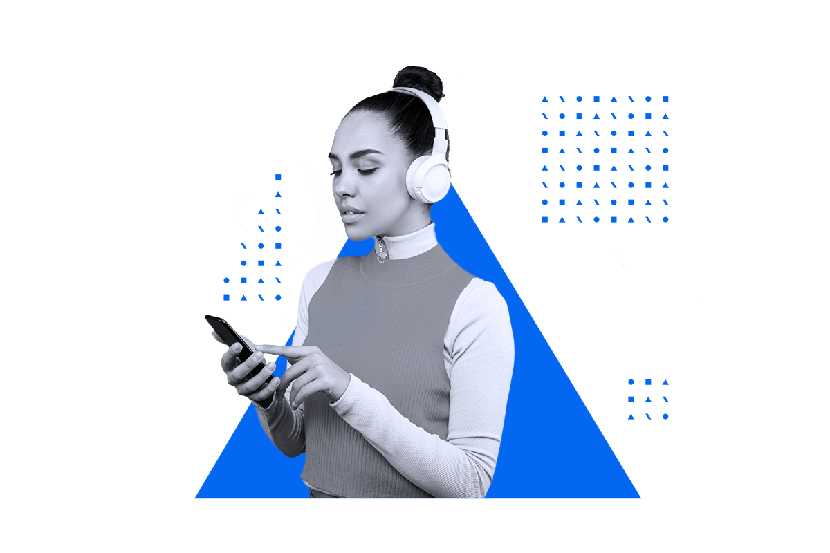
The photographic style was designed to align with the geometric brand aesthetic. Stock and in-house photography were placed within geometric containers extracted from the logo’s shape system. The images were desaturated and treated with a unifying filter, ensuring visual consistency across diverse sources. This approach allowed photos to integrate effortlessly with the pattern design.


The refreshed brand system successfully elevated AION MEDIA GROUP’s visual presence, creating a bold yet structured identity that is both timeless and future-forward. The new design approach ensures consistency across media while allowing creative flexibility for diverse applications.
By embracing a geometric design philosophy, AION MEDIA GROUP now has a cohesive, scalable, and innovative brand system that reflects its core values—perpetual evolution, technological advancement, and an unwavering focus on media excellence.
Get in Touch
Let me know how I can help with your next project!